Tourism & Community Signage

Project Overview
As part of the Tablelands Regional Council’s Tourism and Community Signage Strategy, TRC is adding Walkamin and Mount Garnet to the second stage of the strategy implementation.
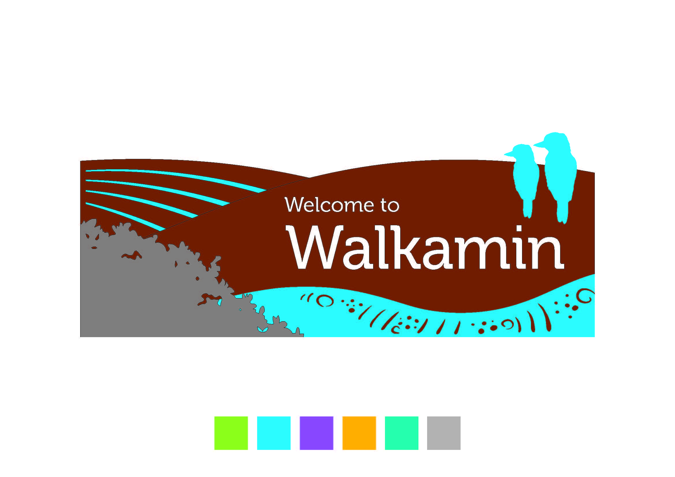
We sought community feedback on the design for each township and had an amazing 339 responses! The most popular colour and icon for Walkamin was the Blue Kookaburra and for Mount Garnet the Grey Rodeo.
For your reference, you can see the final designs for the other townships in the document library.
The township signage will roll out in 2022 across the region.
Proudly funded under the Queensland Government’s Works for Queensland Program in association with TRC.
The Tourism and Community Signage Strategy and design guide will be used to develop future signage, including town entry signs across the region. This is to create a strong brand for the TRC region, support a positive experience for visitors, nurture community pride, provide important information about the region, and aid wayfinding.
Initial consultation was held across the region in May and June 2019. Key themes that emerged to inform the strategy were:
- High visibility
- Reinforce local identity and character
- Clear and simple content
- Consistent approach across the region
- Good quality signs
Designs have been developed to encapsulate the heart of the Atherton Tablelands – rolling hills and rich red soil, farming industries, indigenous history and the unique tropical rainforest environment. Within this overarching theme is the opportunity to celebrate each town’s unique identity.
Through the initial consultation we heard that people of the region are strongly tied to their heritage and really want to amplify both the history of the region as well as its natural beauty.
Each town is unique from the next, and this is important to portray in the signage design. On the flip side there is also a strong sense of community between each town, so an overarching theme and continuity is very important.
Colour palette
The colour palette chosen is intended to reflect the natural and cultural features of the region. Emerald blue reflects the rainforest and lakes; ochre represents the rich soils and indigenous culture; and cream for contrast and visibility.
Materials
A key focus is to use materials that are suitable for the climate, to ensure longevity and requiring minimal maintenance. Corten steel is used throughout the signage design as it is very durable, weather tolerant, and accentuates the earthy, ochre tones of the soils in the region. Stainless steel has also been used to add a secondary textual element that contrasts against the corten steel. Colour panels are used to highlight natural features of the region, and to serve as identifiers for individual towns.
Natural features
- layered hill shapes of each panel, to reflect the rolling hills and vast mountain ranges of the region
- rainforest silhouette cut-out panel in stainless steel
- unique town icon
Indigenous history
- artwork/pattern detail cut-out shaped panel (preferably supplied by local Indigenous artist)
Farming industry
- simple ploughed field detail represented using cut-out coloured shapes